Category Archives: Logo Design
Targeted as Logo Design
Rebranding is a tricky thing to get right, especially if you have a huge fan base that holds a strong infinity with the identity. Get it wrong and it can be disastrous. Social media is now so prevalent that brands can face an instant huge backlash if the customers aren’t happy with the new look. Just take a look at what happened when Gap revealed a new logo. The same scenario has recently happened at Everton Football Club, based in...
Targeted as Logo Design
A defining moment in a designer’s education is when they first learn of the hidden area within the FedEx logo. Once you see it, it’s hard not to focus upon the subtle area of genius. If you’re a creative you’ve probably seen this example of ‘a great logo’ a thousand times in lectures & blogs but it’s always fun to see again. So, if you’re not aware of the forward-facing hidden arrow between the E and x, prepare to have...
Targeted as Logo Design
The long anticipated console produced by Sony, the PS4, comes with a new logo. Well… almost. Whilst there is all a buzz about the new features & possibilities of the actual console, it seems that not much has changed concerning the new logotype. Infact, as far as I can tell, it’s the exact same typeface as it’s predecessor. With claims of new innovative technologies being installed on the machine, I was expecting something a little more adventurous and ‘new’ for...
Targeted as Logo Design
Apologies for lack of a better word, but the new eBay logo really does piss me off. Before we get to that I want to mention my own thoughts about the old logo (shown below) which was used from 1995. A lot of people have been saying that the old logo was dull and outdated. In some respects I can agree with that, the multiply effect of the colouring caused by the overlapping letterforms is no longer a revelation and...
Targeted as Logo Design
Depending on your outlook, you could say that things have got better or worse in the United States over the past 20 years. What is definitely certain, is that Presidential Election campaign logos have definitely improved. Gone are the days of slapping a name in white type on a blue and red striped background. Realising that design can help to play a huge part in decision making, the team behind the now iconic ‘O’ for Barack Obama’s 2008 effort have...
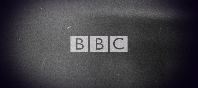
Targeted as Logo Design
We’re all familiar with logos, symbols and brand identities but what exactly is an ident? For those not familiar with the term, here is a quick definition courtesy of Wikipedia. Station identification (ident or channel ID) is the practice of radio or television stations or networks identifying themselves on air, typically by means of a call sign or brand name (sometimes known, particularly in the United States, as a “sounder” or “stinger”, more generally as a station or network ID)....
Targeted as Logo Design
We are all familiar to new logo hoax stories ever since Gap announced that they had redesigned their logo. It’s still not clear if that was a cover up to try and disguise the fact that the ‘new’ logo was in fact awful. Yesterday morning, the official Facebook page for Domino’s Pizza – New Zealand, posted this status with a photograph of a supposed redesigned logo which led many to believe that they may be trying to pull the same stunt...

Targeted as Branding, Logo Design
It’s now been just over 5 years since the logo for the London 2012 Olympics Games was revealed and so we finally get to see it in action, much like the athletes. Never before has the design of a logo grabbed so many headlines, with not just designer geeks venting their disgust but the general public chiming in with their own opinion on the oddly shaped & coloured icon. In general, the logo received very negative feedback with one of...

Targeted as Branding, Logo Design
A mascot – which is defined as any person, animal or identifiable object that is visually used to represent something, can help to bring recognition to a brand identity. As they are also able to help distinguish between competitors and strike an emotional connection with consumers, you could argue that a brand mascot is just as powerful as a logo. You will notice that most brands that have a mascot will often include them in the official logo artwork. The...
Targeted as Logo Design
We are just a few days away from the release of one of the most anticipated movies of all time, The Dark Knight Rises. As with the new Spiderman logo, I thought it would be interesting to compare the new Batman logo to those which had preceded it. As you can see by the great batman logo animation video (via Antupainamku) below, I think you will agree that the recognisable bat shape has gradually got more radical over the years,...
Targeted as Logo Design
This article is published in the new book by www.logonest.com, Logo Nest: 02, the book by Logo Designers for Logo Designers A like for a like With a title like that it would be understandable to assume that this is going to be another run of the mill article on plagiarism. Instead, I have chosen to tackle a subject, which seems to be downplayed or mostly ignored. At the end of each year many graphic design related publications, both online...
Targeted as Logo Design
Fans of the Spider-Man franchise will be pleased to know that along with a new movie that is due to be released on 3rd July 2012, comes a new iconic spider logo. The move is possibly due to the new version of the classic comic by Marvel being a reboot of the original film rather than a sequel, so what better way to make a difference that to give it a fresh identity. Below is a comparison of the previous...