Gareth is a brand identity designer specialising in creative logo design & identity.
He is the author of Smashing Logo Design, a book dedicated to everything 'logo'.
We are pleased to discover that the logo we designed for Pig Dog has been included in the great new book ‘Los Logos 8’ by Gestalten. The book really is a wealth of inspiration and we are enjoying browsing all of the brilliant logos included. If you are interested in purchasing the book it can be bought on Amazon.
I recently took a trip down to Western-super-Mare to see the closing day of Banksy’s latest masterpiece, Dismaland. Constructed in a 10,000 sq ft disused lido, Dismaland was a pop-up exhibition that lasted for just over a month. With 58 artists submitting work, and ten new pieces from Banksy himself, the event soon became a popular attraction for the usually sleepy seaside town on the South West British coast. We soon found out for ourselves how hard it was to get tickets, even though 4,000 per day were put on sale, people on eBay were paying almost 15 times the original £3 entry fee or queuing for up to 8 hours in hope of getting a ticket on the door. I am sure that if you speak to anyone who stood in line for hours on a relatively mild September day, they will tell you it was definitely worth it.
A tongue-in-cheek art event of this scale was unprecendeted, and anyone who enjoys art that pokes fun at the corporate world or contains a deep political message in a comical way would delight at what was on offer. The sheer scale of the place was impressive and the little details are what made it feel like a real theme park with a dark twist.
It doesn’t need a genius to explain the inspiration behind the name or logo that Dismaland used. It seems it is an almost mish-mash of past and present Disneyland logos, with a distressed overlayed texture to hint towards the decaying installations that are contained inside the park. Let’s just say that the organisers (not just Banksy) went on a full assault in terms of the Disney mimicry. It will be interesting to see if any copyright lawers will be in touch.
Perhaps the most shocking and hard-hitting piece of work in the park was what you could describe as the centre piece, which was of course created by Banksy. Inside a decrepid Cinderella castle made from sheet metal and other misused objects, was a sculpture of blonde princess who seems to be dead, slumped over a pumpkin carriage drawn by dead lying horses which lay beside the crash site. The installation was in a very dark room, and could only be seen briefly every couple of seconds due to the flashing lights of papparazzi figures that were crowded around the tragic scene. You can probably guess what this refers to.
There are simply too many pieces of thoughtful, shocking and powerful works of art that I have chosen to simply show them in photographic form below. What cannot be documented in images, is what for myself was the best part of all and that is the staff who worked there. Their attititude was spot on. Unpleasant, short, and times spiteful to really ram home the message that this place was the complete opposite of Disneyland. If you work at Dismaland you don’t have to pretend to be happy or that it’s the best place on earth. Whilst I was there, I asked one of the attendants for a map. Rather than cheerfully hand me one, the young girl who was sporting a hat with Mickey Mouse ears that had been poorly taped on, instructed me to pick one up off the floor. At the sand pit, which was supposed to keep young kids entertained, the attendant would wait for a sand castle to be built by a proud child, and then completely destroy it by stamping on it. Cruel, but this is Dismaland after all. If you won a game at one of the dismal attractions dotted around the park, the Dismaland worked threw your price on the floor. This coulbe be a badge, a chip inside a plastic bag or an amusic wristband that displayed the words ‘Meaningless’ on it.
The more cynical older crowd may think ‘what a waste of money’ all of this was, and in some ways they are right. I kept wondering if Banksy would be laughing or not at the amount of people clamouring to buy official Dismaland merchandise in the store via the gift shop (through the exit of course). The programme does include some interesting process sketches so you can see how the Bemusement Park became a reality. As an added bonus, it seems that Dismaland is to be dismanatled and put towards a good cause.
Unless you have been living under a rock for the past 10 months you will know that the 4.3 million people of Scotland will today answer the simple question: “Should Scotland be an independent country?”. There are only two simple answers: Yes or No.
Even though the political arguments for each side will and should be at the forefront of voter’s minds, the subliminal design choices to present each option will have had a subliminal impact for some. I have no ties to Scotland, other than the fact that I’m British, so if I put my political/financial beliefs aside, it’s been interesting to look at the referendum from a typographical perspective. I’ve already seen people on Twitter claim that they didn’t feel like they voted for something, it felt more like they were picking their favourite colour. That may be a simplistic view but you cannot ignore the fact that the power of branding will have played a small part along the way in deciding the outcome.
The words ‘Yes’ and ‘No’ are probably the bare essentials of the English (or should I say British) language, which proves making them visually appealing to voters a tricky concept. Let’s take a look at how both sides of the argument chose to present represent their vote.
Yes
Yes is a positive word, which is an advantage already.
They have used the traditional blue and white colour scheme that is taken from the Scottish Saltire which will make pull at the patriotic heartstrings of Scots.
The font used is strong to symbolise a bold message.
The type has been set very tightly which could be seen as representing people coming coming together to vote for a new future. This makes it look more approachable and friendly.
Conversely, No is a negative word which proves making it appear attractive to people a difficult task. Unless of course, you really really think that independence is a bad idea.
‘THANKS’ has been added to make the statement seem more polite.
The colour red is a controversial one. Red is often perceived as a warning for something dangerous which is strengtened when paired with the word ‘NO’. ALternatively, Red is a subtle hint towards the Labour Party.
The logotype has also been used in a variety of other colours, even in a blue that is similar to the Yes campaign. This inconsistency causes confusion.
A rounded font has been chosen to make it look less aggresive and abrupt.
There is a subtle cross within the filled ‘O’, which reminds the viewer what they have to do. When used in blue it looks like a reversed out Scottish saltire.
Interestingly, the main campaign for staying a part of Britain doesn’t use ‘No’ in their identity. Better Together use a completely different logo, which is more suitable and friendlier. The problem is, they have to still promote the word ‘No’ to make sure people know what to vote for.
The referendum result won’t be decided until Friday 19th September, but if I had to choose based on the campaign design efforts, then I can’t help but think that ‘Yes’ edges it, mainly because they are consistent throughout. Looking at it purely from a design perspective, who would you vote for?
Rebranding is a tricky thing to get right, especially if you have a huge fan base that holds a strong infinity with the identity. Get it wrong and it can be disastrous. Social media is now so prevalent that brands can face an instant huge backlash if the customers aren’t happy with the new look. Just take a look at what happened when Gap revealed a new logo.
The same scenario has recently happened at Everton Football Club, based in Merseyside, England. Everton are one of the oldest clubs in the world and have played in the top flight of English football for a record 110 years. As with most clubs, their fans are extremely passionate and so the club crest is a big part of their lives. I have no doubt in saying that it adorns thousands upon thousands of replica kits and merchandise which the loyal fans purchase. So what happens when the club decides to change an image that is ingrained in the hearts of many…the club logo (or crest if you want to be technical). The image below shows the old logo on the left, and the new version on the right.
The feedback from Everton fans hasn’t exactly gone the way the club wanted. Many have claimed that they could do a better job themselves (I would love to see them try), but most are outraged that the decision has been made to remove the laurel wreaths & club motto. The reason for these decisions are that they previous crest was too hard to reproduce and that it needed to be modernised. As a summary here are the changes:
The two laurel wreathes are no more
The club motto ‘Nil Satis Nisi Optimum’ and banner have been removed
The typeface for 1878 has been changed and is now less prominent
The illustration of Prince Rupert’s Tower has been redrawn completely
The shape of the containing crest is now fatter and more bulbous
The radial gradient has been replaced by a solid and more vibrant blue
‘The typeface for ‘Everton’ has been tweaked slightly and now placed inside the crest
My opinion is that there are some improvements but that it has possibly been simplified too much. The motto will obviously mean a lot to supporters so to get rid of it completely was a daring move. I prefer the new blue and I agree that removing the gradient will improve reproduction. The main thing that bothers me is that the new illustration of Prince Rupert’s Tower, a famous landmark in Everton has become so simplified that it now looks like a curious clown (especially when coupled with the bright colours). You don’t want to be looking like a bunch of clowns on a football field.
The negative opinions of Everton supporters on the redesign have been so strong that an online petition was formed to change it back, and was subsequently signed by over 20,000 people. In a bizarre but welcomed u-turn, a statement was released on the official website by Everton FC Chief Executive, Robert Elstone. It reads:
“Clearly the weekend’s response has meant that we have reviewed how we went about the whole of the re-design process and while many objectives were achieved, we recognised we missed the key part out.
Our chairman had demanded widespread consultation and we stopped short of that. We talked to our Fans’ Forum, our commercial partners and our experienced staff around the club. That was not enough.
We want to put this right. While the time-constraints of kit suppliers in particular present challenges, which inevitably means the version released on Saturday will be in operation for the 2013/14 season, we are determined to give our fans a greater say in how we represent the club on our jerseys, at Goodison Park and across media around the world.
In advance of the 2014-15 campaign, we are turning to you to help us shape and refine the badge we’ll adopt in the future. Evertonians from all sections of the fan-base will be pulled together in a fully transparent way.”
So with the promise that the logo could be changed for the 2014-15 season, might a happy medium look something like this?
It’s good to see that brands are listening to their audience but at the same time it is worrying that social media now gives a voice that is so strong it can help craft the identities of the brands themselves, kind of like customer crowdsourcing. It would help though if the design teams got it right in the first place and actually consulted their people before changing something that obviously means a lot to many people.
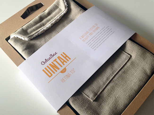
After deciding to start working from home again at the start of the year, I sold my trusty iMac and acquired a 15″ Retina Macbook Pro. Being mobile again is brilliant but having to carry around a really valuable piece of kit made me want to invest in a reliable form of protection for my laptop. Rather than purchase a solid case I figured I would prefer a more natural looking sleeve. Having looked at various styles I eventually found a great company called ColcaSac.
I love their website, branding & of course their products so decided to buy a Uintah Macbook Sleeve which I have reviewed below.
The main selling point for me was that each sleeve is made by hand from eco-friendly materials. I had to wait a relatively short amount of time for a product that came from outside of the UK and as an added bonus there were no extra customs charges. Upon opening the plain outer packaging I was greeted with the surprise of just how well the product is packaged. You can really tell that ColcaSac is a company that has really put a lot of thought into the identity of their product, and their approach reminds me of the way Apple is perceived. To me, ColcaSac are like an eco-friendly Apple (in terms of branding), except on a much smaller scale. This is reflected in the simple yet elegant packaging that is also friendly to our environment. No plastic here!
Removing the product from the packaging was a doodle, and brought with it another welcome surprise. Each sleeve comes with a cute little manual that explains how to use it. It’s really simple to use since all you have to do is put your laptop inside, but I thought this was a nice extra touch (it’s all in the brand!). The manual is illustrated with simple diagrams and easy steps to ram home the message that this is a hand made piece of kit.
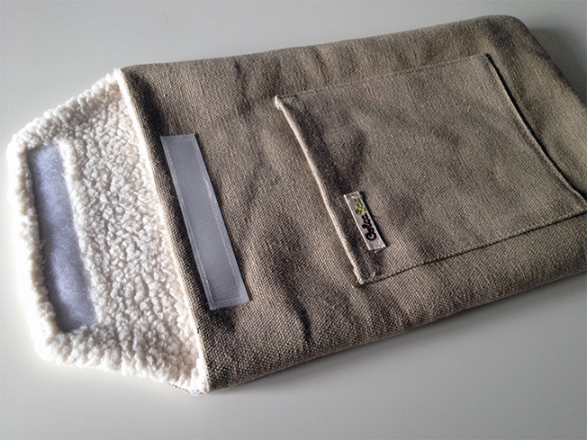
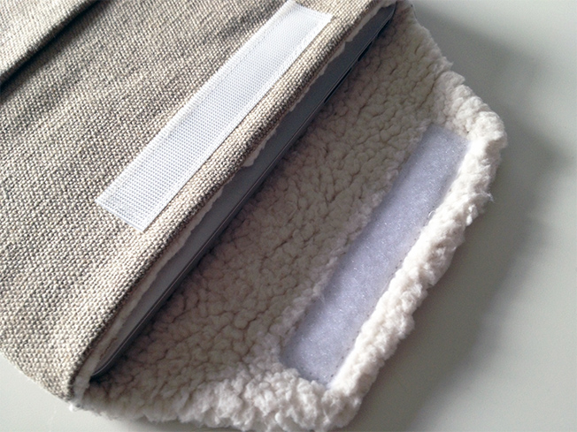
The sleeve itself is really lightweight yet extremely thick. The Uintah model, which I purchased, is made from a material that feels like an industrial sack that you would expect to see used in an old flour mill. Its lining is really soft and really makes you assured that it will not scratch your precious equipment.
The hand front pocket makes it easy to carry accessories and the Velcro flap gives you extra security. Unlike most other sleeves, the ColcaSac allows you just enough room to charge your laptop even when the flap is fastened. This was a really important factor for me when making a decision.
When it comes to the fit, this is the most snuggest that you can buy. There is no chance at all of your laptop falling out. At first it can feel a little tight, but don’t be alarmed as this is fully intended. After a while the material stretches slightly to create the perfect fit. Think of this sleeve as like a pair of denim jeans, you have to wear them in a little to make them truly your own.
In summary, I am 100% happy with my ColcaSac. The materials are brilliant, the price is competitive and it does exactly what I want. The only downside is that I am not sure it would offer much protection if you were to drop it on the floor but I intend to be extremely careful since my new laptop is now incredibly important to my career and now my ColcaSac is too! So much so that I’m tempted to buy another one or maybe even a sleeve for my phone.
You can check out the full ColcaSac range at www.colcasac.com. I’d just like to point out that this review was purely off my own back as I wanted to give thanks in some way to a truly revolutionary product design. The video below, which explains how each sleeve is made, is definitely worth watching too!
A defining moment in a designer’s education is when they first learn of the hidden area within the FedEx logo. Once you see it, it’s hard not to focus upon the subtle area of genius. If you’re a creative you’ve probably seen this example of ‘a great logo’ a thousand times in lectures & blogs but it’s always fun to see again. So, if you’re not aware of the forward-facing hidden arrow between the E and x, prepare to have your mind blown.
For many, FedEx is seen as the pinnacle of logo design achievement. Solid form, with a clever hidden twist that creates a smile in the mind. I’ve said on many occasions that a logo doesn’t have to be clever to be successful, but it can help to get recognition. Let’s face it, those ‘AHA! I see it!’ moments can feel good, for both designers and viewers. Unexpectedly, I had one of these myself recently whilst looking at the packaging of a product that I use every single day.
To the untrained eye the Gillete logo may just look like any other commercial font that you might expect to be used by large corporate companies. It’s set in a modern sans-serif typeface which you could argue is a ‘very safe’ bland option. The italics give a sense of speed & the extra bold weight makes it look less threatening. I had always noticed the diagonal slice on the i but if we look closer, especially in the negative space created between the G & i, you might see something more familiar.
The negative space forms two blade-like shapes on top of each other which is obviously a reference to the product that Gillette produces. That’s what I love about great logo designs. For me, trying to force something to work in a clever way that can look awkward just for the sake of a clever trick is far inferior than the subtle hidden elements that don’t smack you in the face and try to grab your attention. That’s what can make a logo truly memorable.
The long anticipated console produced by Sony, the PS4, comes with a new logo. Well… almost. Whilst there is all a buzz about the new features & possibilities of the actual console, it seems that not much has changed concerning the new logotype. Infact, as far as I can tell, it’s the exact same typeface as it’s predecessor. With claims of new innovative technologies being installed on the machine, I was expecting something a little more adventurous and ‘new’ for the identity. What do you think?
I’ve not so secretly been working on my first ever complete typeface design and subsequent font for the past three years. For those who haven’t done this before I can’t begin to tell you how labourious the whole process is. I’ve pretty much drawn up the majority of the letterforms and extras bar a few symbols which I may or may not decide to include. The main intention is for this to be used as a display typeface, though when I original first designed the original ‘GOLD’ logotype, the idea was to produce a set of forms that could easily be used to create ambigrams.
I’m hoping to release this font for general sale in the next couple of months and then I’ll spend time working on the rest of the weights, which hopefully won’t take as long as this one has. Let me know what you think…
Apologies for lack of a better word, but the new eBay logo really does piss me off. Before we get to that I want to mention my own thoughts about the old logo (shown below) which was used from 1995. A lot of people have been saying that the old logo was dull and outdated. In some respects I can agree with that, the multiply effect of the colouring caused by the overlapping letterforms is no longer a revelation and the typeface choices aren’t exactly plucked from a modern type foundry but at least it relayed a message to the viewer, even if it was very subliminal.
To me, the overlapping letters symbolise a community engaging and trading with one another. I also love that the type is not set on one baseline and so the random arrangement looks jumbled, which I take as being a hint towards the site being a huge place to find and purchase anything that you need. Like one giant jumble sale.
Now that eBay has announced they are shifting focus away from auction listings to compete with the biggest online retailer, Amazon, they obviously felt that the previous traits of the logo were no longer needed and I can understand that. So let’s take a look at the new logo below:
Set in Univers Extended, the overall look is undoubtedly much cleaner than it’s predecessor. I also like how the colours have been toned down slightly (especially the blue) to achieve a more harmonious palette. Yes, the tight kerning makes the characters touch one another so there is at least some attention to detail, but other than that what else is there to remark upon?
I am a big supporter of the notion that ‘less is more’, but I feel that there is a trend developing whereby this is being taken to new and unnecessary extremes. eBay aren’t the first to opt for the ultra safe option for their new identity and I’m pretty certain that others are going to follow suit. We’ve already seen Domino’s and Microsoft strip down their logo to nothing more than the bare essentials. I’d put money on this new trend will be come a cliche sooner than later as start-ups often tend to try and imitate the big hitters.
The problem is though, if you take too much away (especially when rebranding), a logo can lose it’s character and the connection that it once had with its target audience. This new eBay logo doesn’t say anything to me other than trying to be like everyone else and in a way they have lost a big part of their identity. I just hope that new logos of huge corporations in the future dare to be a little different.
Depending on your outlook, you could say that things have got better or worse in the United States over the past 20 years. What is definitely certain, is that Presidential Election campaign logos have definitely improved. Gone are the days of slapping a name in white type on a blue and red striped background. Realising that design can help to play a huge part in decision making, the team behind the now iconic ‘O’ for Barack Obama’s 2008 effort have set a precedent (not president) for the future. That’s one change that seems to have definitely been achieved.
Four years later Obama is still utilising that now famous image, albeit in a new fashioned rehash of the original graphic which is now embedded in bold ‘2012’ numbers set in slab serif type. Obama’s electoral opponent, Mitt Romney, also seems to have grasped that a campaign icon is a valuable asset and has followed suit by using a stylised ‘R’, even though it is far less inspiring in both execution and message than Obama’s.
As previously mentioned, prior to 2008 there were few differences between logos/signage used by both opposing candidates for the presidency. There is however, and probably always will be one consistent theme. The blue and white coupled with the stars and stripes which are embedded as the identity of the US have featured in some form since the year 1960, back when John F. Kennedy made it in to The White House.
Take a look at some of the comparisons below of the US Presidential Election Campaign Logos of the last 20 years and see if you can notice some early logo design clichés:
2012
2008
2004
2000
1996
1992
If you are interested in more than just the logos used, including websites and TV Ads, you can visit a great website which has a huge archive, www.4president.org.
We’re all familiar with logos, symbols and brand identities but what exactly is an ident? For those not familiar with the term, here is a quick definition courtesy of Wikipedia.
Station identification (ident or channel ID) is the practice of radio or television stations or networks identifying themselves on air, typically by means of a call sign or brand name (sometimes known, particularly in the United States, as a “sounder” or “stinger”, more generally as a station or network ID). This may be to satisfy requirements of licensing authorities, a form of branding or a combination of both. As such it is closely related to production logos used in television and cinema, alike.
In short, they are a means of helping viewers to identity the channel they are currently watching. Without them, station logos would have little on screen presence other than being a small image in the corner of the screen, and so idents are crucial to TV stations. Whilst growing up, I would see the idents for popular UK channels such as BBC Two and Channel 4 every Saturday morning, right before my favourite cartoons were about to start, so I knew I had the right channel. What I love most about idents is that they bring logos to life, often in quirky animated forms, which helps to further cement an affinity or a preference with any chosen channel.
Back in those days (late 80s to early 90s) there were only four channels here in the UK. Now, of course, there are hundreds and we are lucky enough to be able to tune into stations from all over the world via satellite television. Whether that is a good or bad thing is for you to decide. I recently thought it would be a good idea to have a look back at some of the idents from my favourite channels. Watching them back has made me realise just how important and powerful they are from a branding perspective. Even the music used can instantly remind our senses of a particular moment in time for any given channel, which reminds me that branding isn’t just a visual experience.
I came across a great site that showcases over 3000 archived idents at www.theidentgallery.com – which is worth a visit if you are interested in logo or motion design in any way. I’ve compiled some videos below that show the history and progression of some of the idents for the most popular TV channels in the world. It’s quite scary to see how much design and technology has evolved, though some of the early ones are interesting and beautiful in their own right. These days, some of them have effects on par with short films from Hollywood. There are hundreds more for you to watch via IdentChannel on Youtube
We are all familiar to new logo hoax stories ever since Gap announced that they had redesigned their logo. It’s still not clear if that was a cover up to try and disguise the fact that the ‘new’ logo was in fact awful.
Yesterday morning, the official Facebook page for Domino’s Pizza – New Zealand, posted this status with a photograph of a supposed redesigned logo which led many to believe that they may be trying to pull the same stunt as Gap:
However, it seems that after reading this official press release that the new logo may be the real deal (2 for 1 anybody?). So what do you think? Here is the current ‘old’ logo on www.dominos.com that everyone is familiar with:
And here is the apparent new design again just for comparison:
Spot the difference
The biggest differences are that ‘Pizza’ has been dropped from the type completely and the familiar square icon now looks like your average domino mark. Though it could be argued that it looks like an open pizza box with hot food inside (that’s if you’re an optimist). The typeface has been changed and now has a rounder and plumper appearance to match that of the domino icon, though it looks awkward in terms of the layout of the mark and the type. One other thing to mention is that the domino mark has a TM Trademark symbol whilst the logotype has a ® Registered Trademark symbol which suggests that the logotype has been registered but the mark hasn’t or is currently going through the process? It seems like an odd way to announce something like this but I guess that is a sign of the times. It will be interesting to see how this (deep) pans out.

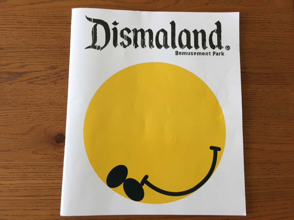

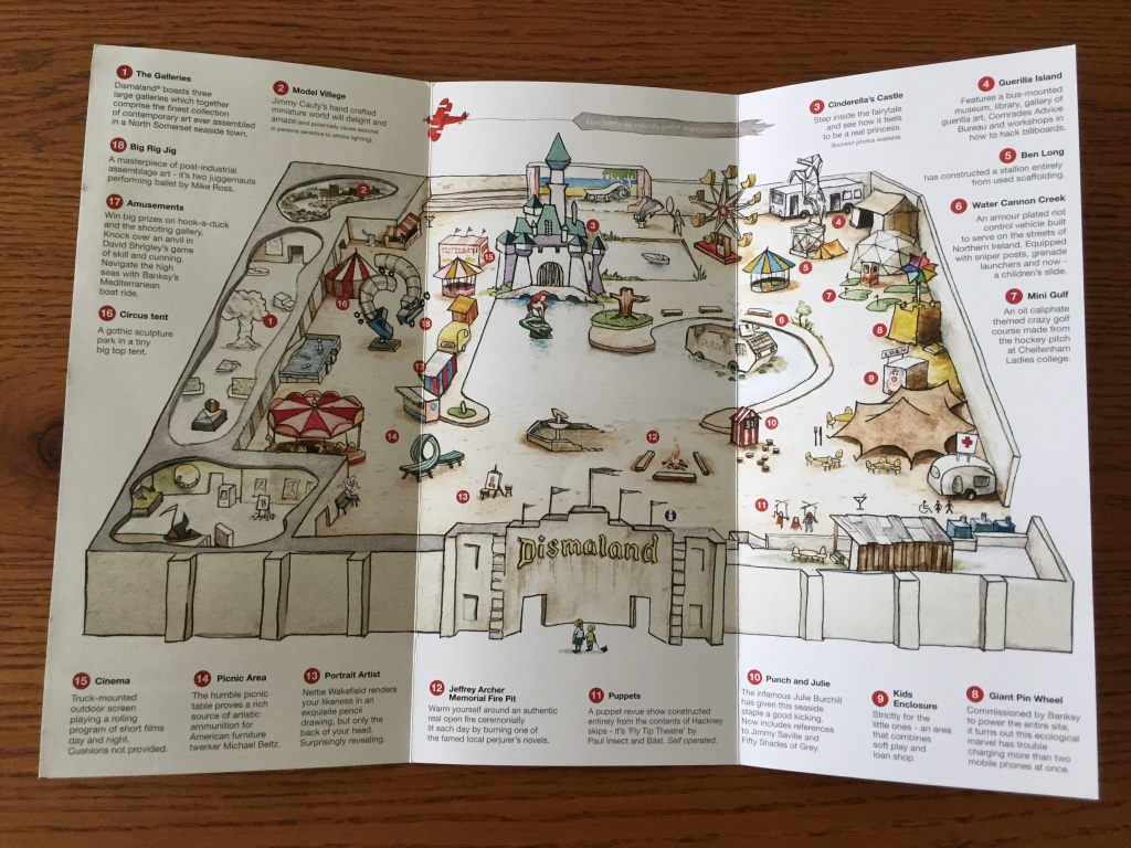
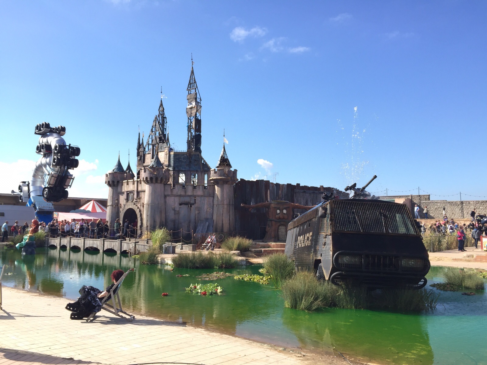

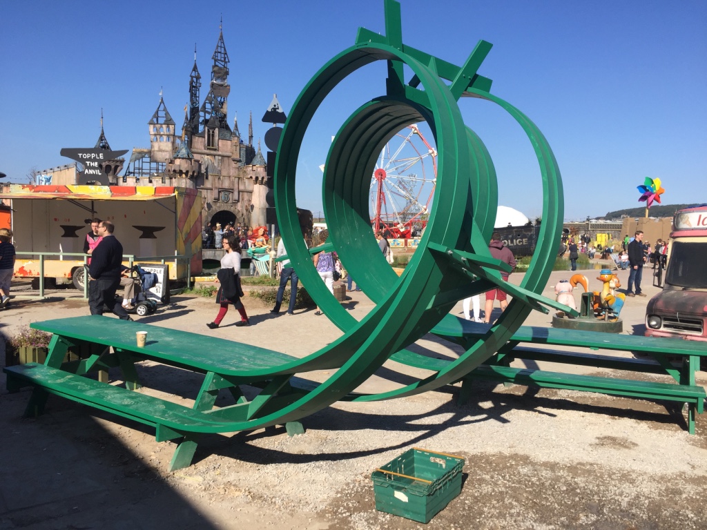


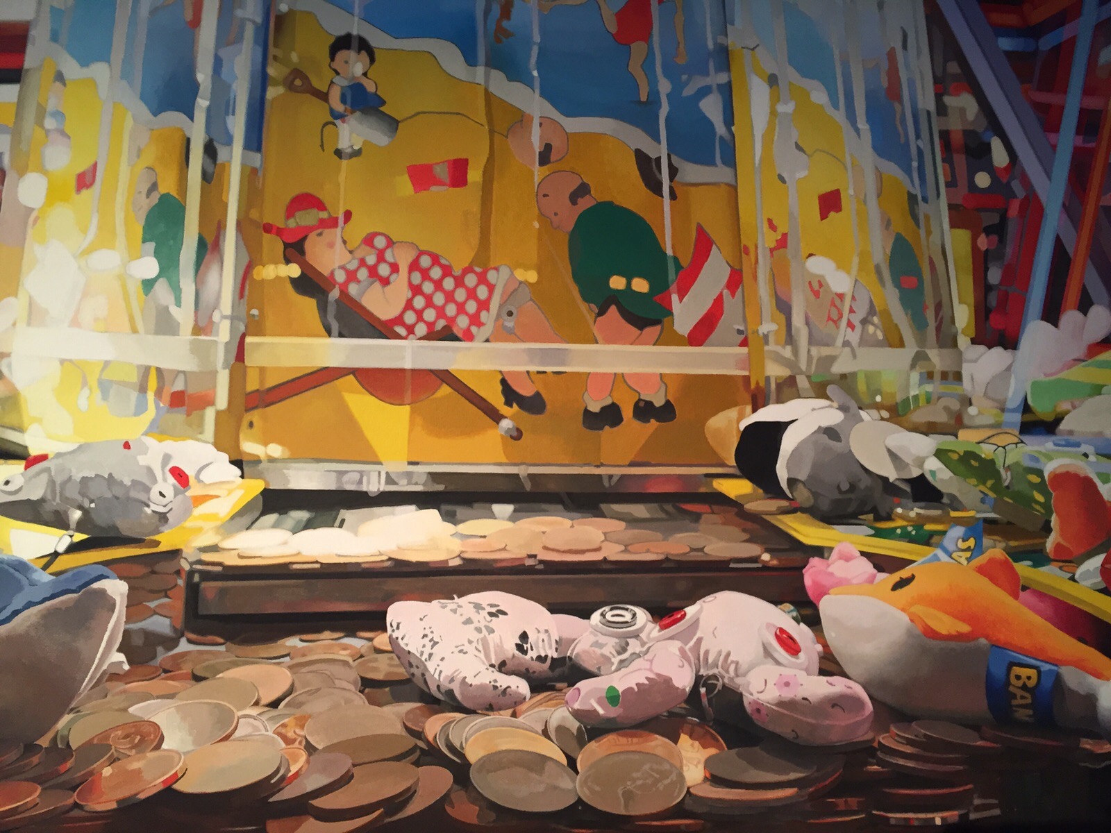


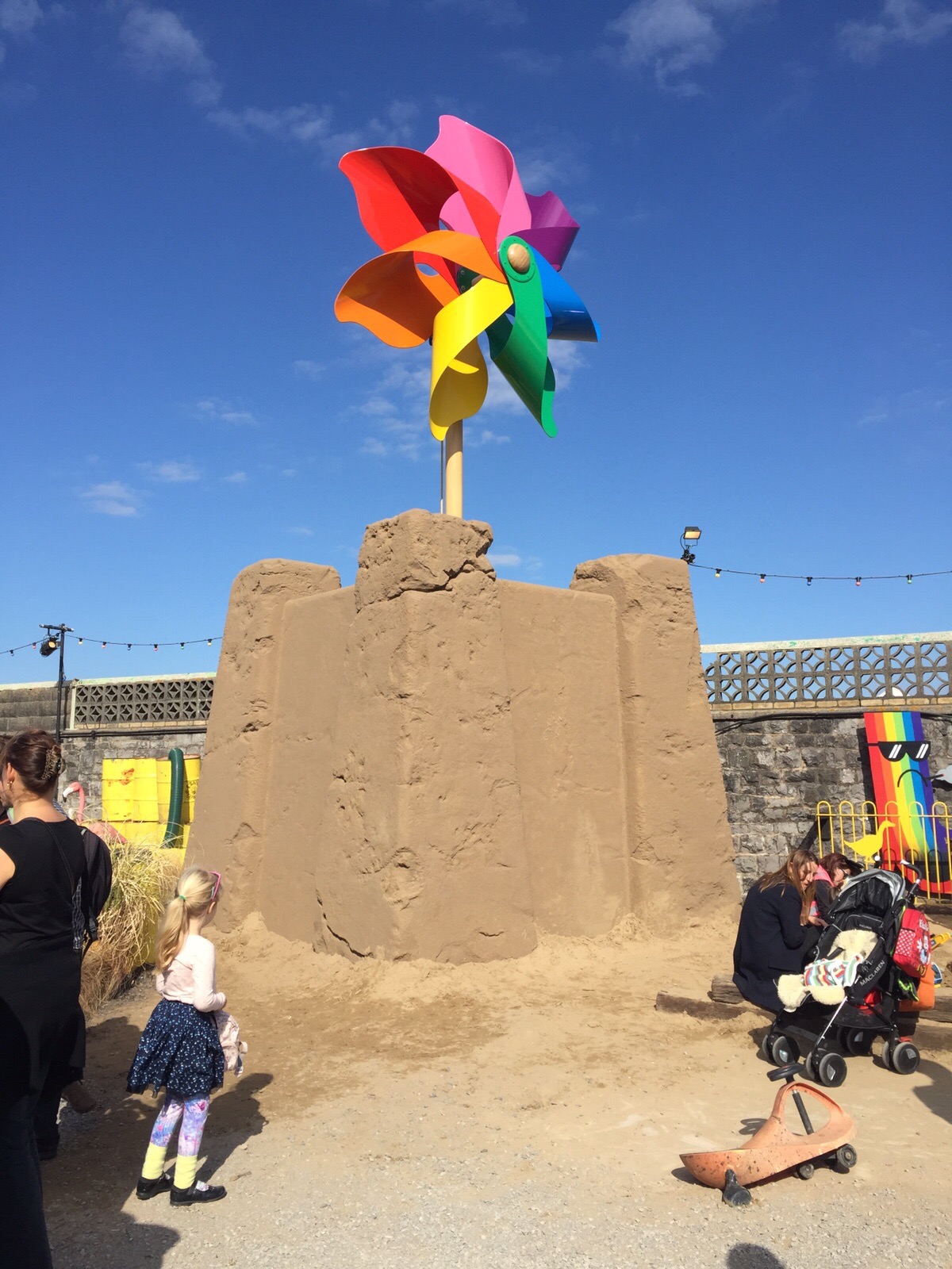

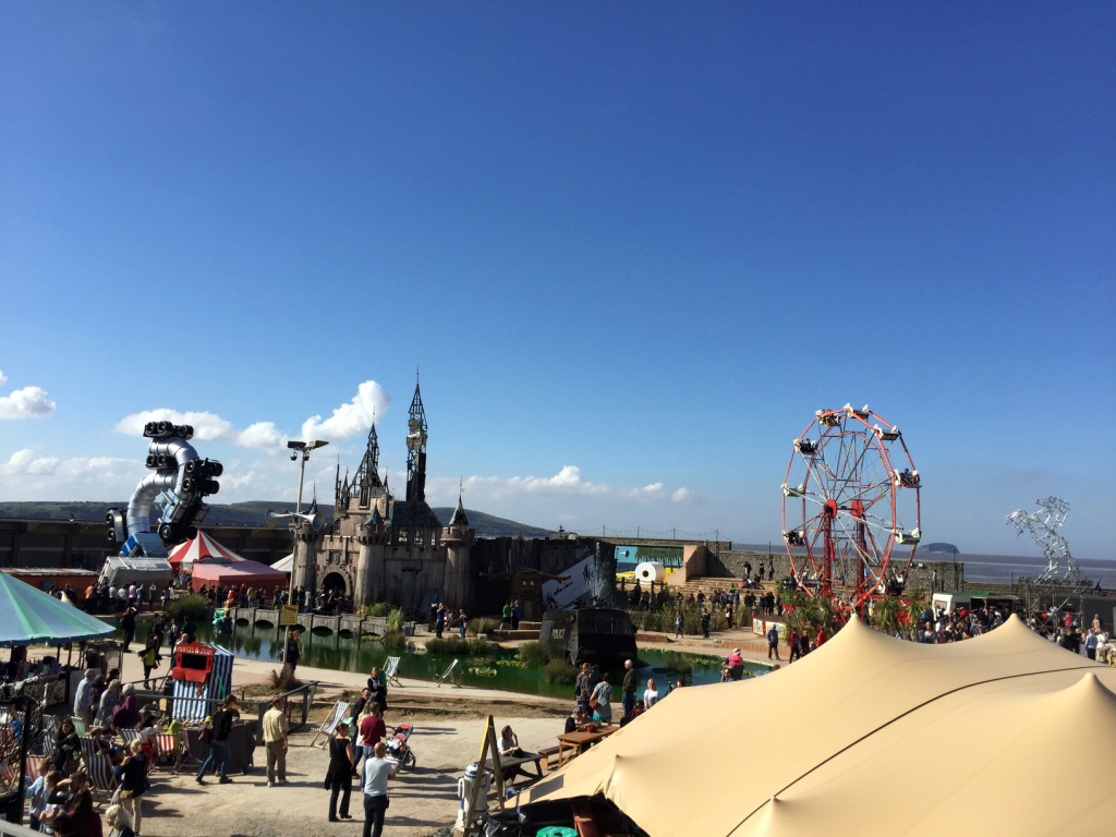
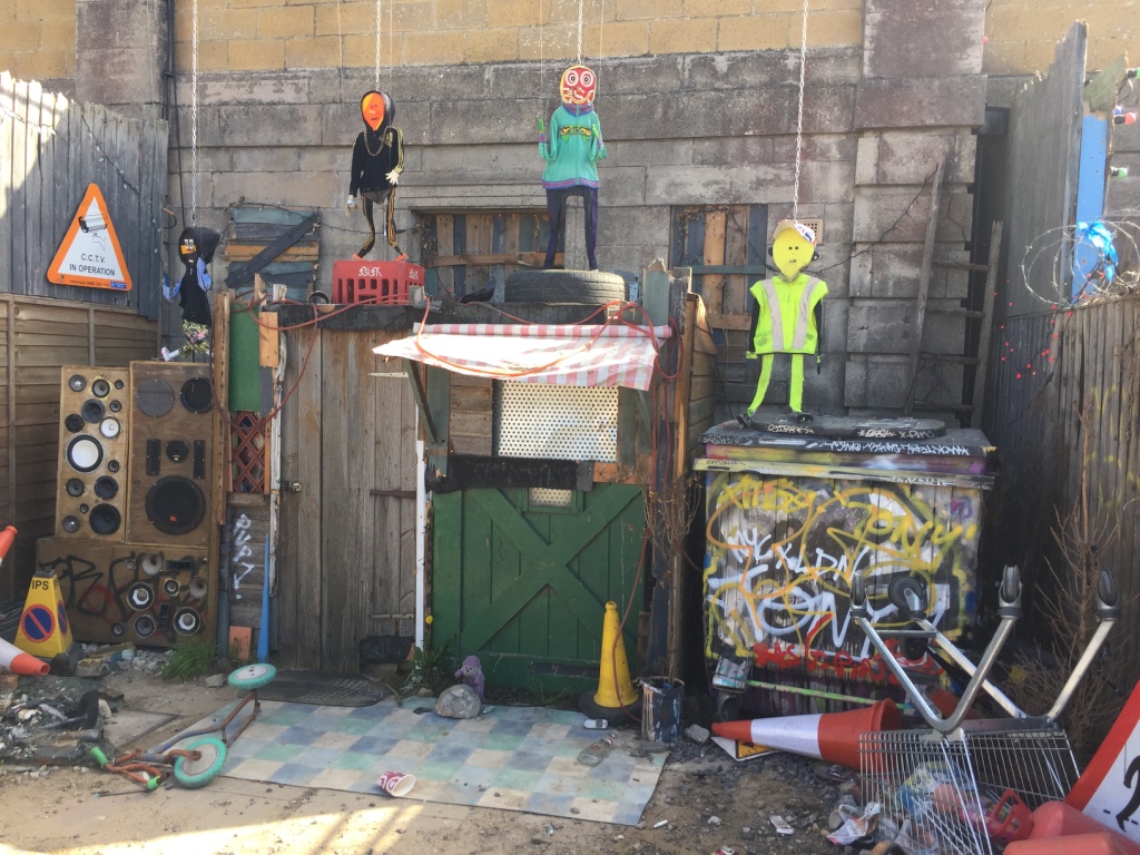

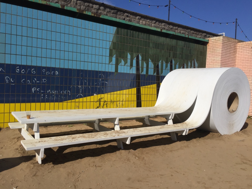

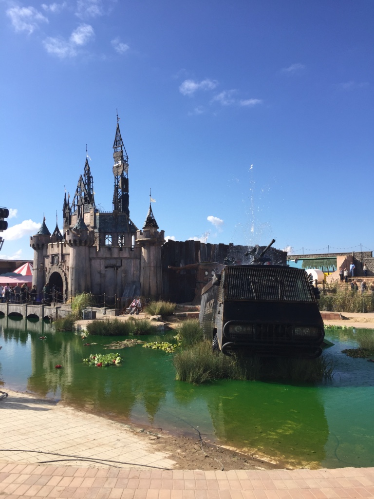
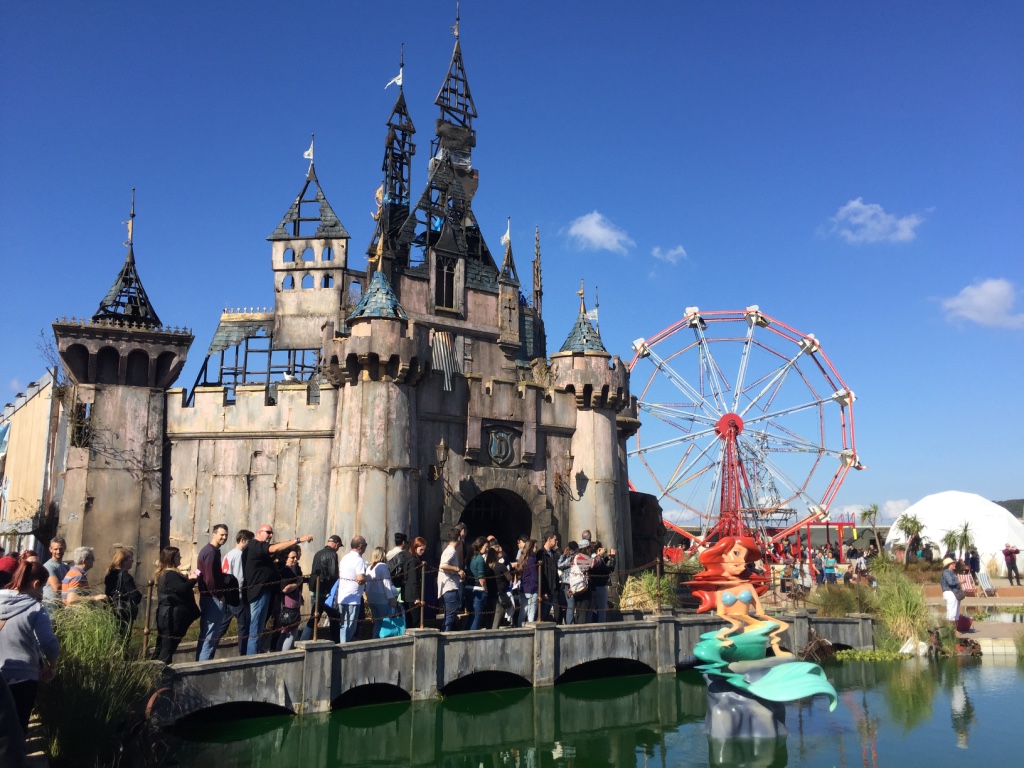


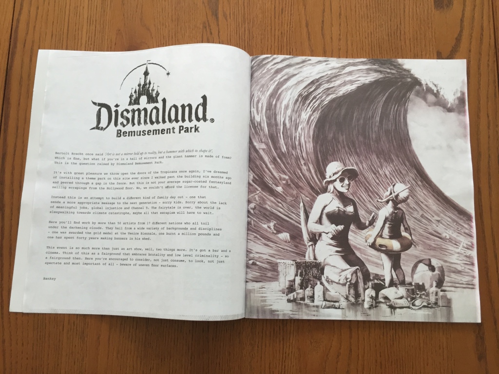


 Photo:

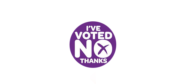
 Photo: