Case Studies > Logo Design & Identity
Logo Design & Identity
COMPLETED
- Logo Design
Jungpark
Jungpark is a web development company in Berlin, Germany. The brief requested a custom designed bird icon.

ICPCA (Information Center for the Prevention of Cruelty to Animals
Forthcoming Information Center for the Protection of Cruelty to Animals. The icon symbolises putting a stop to the heartache of suffering animals.

Dianne Dieplo
Dianne Dieplo is a classical voice training coach based in Argentina. The monogram is comprised of two ‘d’s and a crotchet note.

Harvester
An independent organic food company based in the heart of the United Kingdom. The concept is founded upon being ‘The king of the crop’.

Gnomeangel
An illustrated logo for a blog & online shop about handmade jewellery. We espcially enjoyed illustrating a personal character that brings the brand name to life.

Pixeldemon
A logo initially created for practice in the early days, which was then adopted by an american web developer.
![]()
Wine Searcher
We pitched a new identity to one of the biggest online wine dtabases. Inspiration was drawn from the simple contours of a wine bottle.

See:Evil
See:Evil was the first logo design we ever created. It was initially for a skateboarding & artists collaborative, symbolising the dangers and bravery of extreme sports.

Bright Sparks
A charity that helps kids with promise reach their potential who come from underprivileged families. This is symbolised by he child being lifted by the lightbulb balloon.

Solangel Properties
Solangel Properties is a new organistaion formed in the UK which offers help, guidance and support to British citizens seeking to start a new life in Spain.

Jam Session
We designed the logo for an online guitar lesson website. A guitar icon is incorporated into the logotype.

Superlatief
A rebrand for a web design & development agency in The Netherlands. ‘Anders online’ is dutch for ‘different online’.

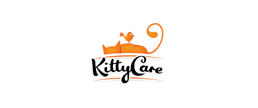
KittyCare
KittyCare is a new range of cat care products based in the Czech Republic. The illustration symbolises cats being at ease even in the presence of their supposed enemies.
Course Explorer
Originally part of the pitch to Wine Searcher, which would evolve to cover various search related websites. Course Explorer would form the golf search website.

Velloci
Velloci is a fashion brand based in Bahrain. We designed an icon which puts them on par with the biggest fashion houses in the world. The mark is also used as a repeatable pattern.

Dig for Saint Michaels
An identity for a charity fundraising event involving the renovation of Saint Michael’s church. The icon is a combination of a spade and a stained glass window.

Punchbox
A games developement company who creates exciting games for mobile devices and online operating systems.

Wasteline
Wasteline is a recycling start-up based in the West Midlands, UK. The logotype is created using custom letterforms which resemble every day recycle objects.
Almog Design
An interactive designer based in Istrael commissioned us to design their new identity. ‘Almog’ is hebrew for the word ‘coral’.
Caraweb
Caraweb is a provider of wireless internet services to caravan websites in the UK. The icon incorporates a wireless symbol with a secion of spiders web.

BR&ING
BR&ING (pronounced ‘branding’) is an online portal which showcases everything related to the craft of branding. The ampersand replacing part of the word is a visual representation of the process of branding.
Another Boring Bird Tweet
Another Boring Bird Tweet is a bird watching blog run by our good friend Cath Watson.

